
Screen printing vector artwork is the non-negotiable file requirement that trips up more business owners than any other production standard — and understanding exactly why saves you from rejected orders, wasted money, and missed deadlines.
If you have ever been on the receiving end of one of these messages, you already know how frustrating it is when you do not understand exactly what went wrong or what you are supposed to do differently. This guide explains everything — why screen printing companies require vector artwork, what makes a file genuinely print-ready, what happens when you send the wrong file, and how to get the right file fast even if you only have a PNG or JPG to start with.
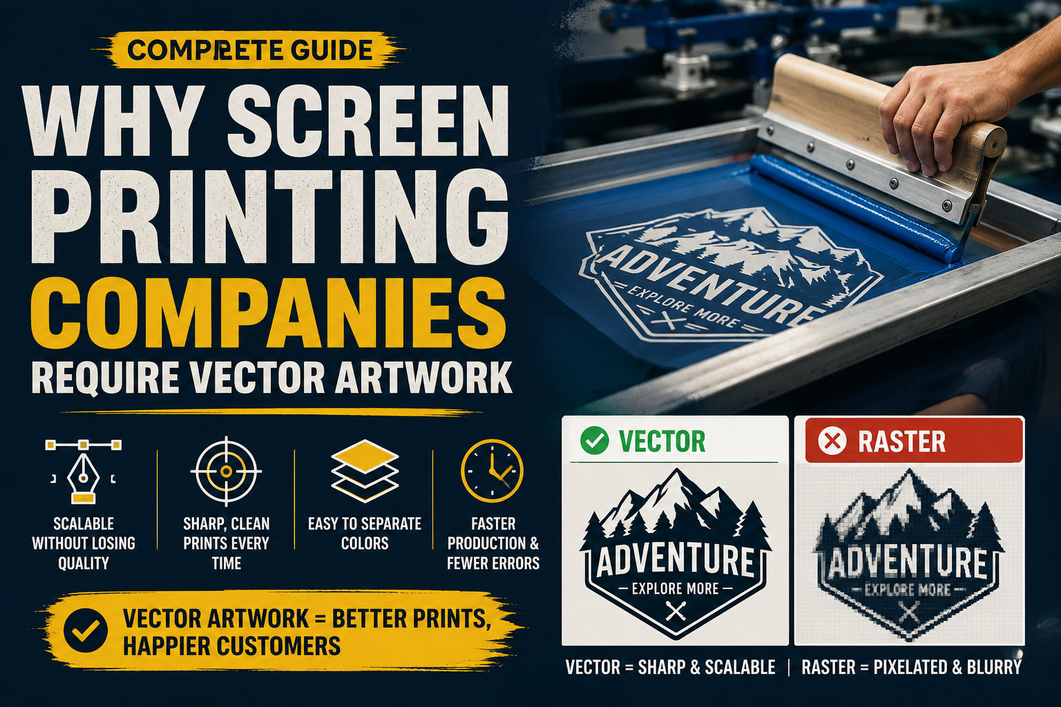
Raster vs vector — screen printing comparison
| Factor | Raster (PNG / JPG) | Vector (AI / EPS) |
|---|---|---|
| How it stores images | Fixed pixel grid — each pixel has a color value | Mathematical paths — shapes defined by coordinates |
| Scales without quality loss | ✗ Blurs and pixelates when scaled up | ✓ Perfectly sharp at any size |
| Color separation | ✗ Colors blend at pixel level — hard to separate cleanly | ✓ Each color is a closed path — separates perfectly |
| Edge quality | Soft anti-aliased edges — causes color fringing in print | Hard mathematical edges — crisp on any substrate |
| Film positive production | ✗ Pixel edges create imprecise film positives | ✓ Clean paths produce sharp high-contrast film positives |
| Accepted by screen printers | ✗ Typically rejected or charged a prep fee | ✓ Accepted everywhere when properly prepared |
Screen-print-ready vector file checklist
| Requirement | Status | Why it matters |
|---|---|---|
| All artwork built from vector paths | Required | No embedded raster images — every shape must be a mathematical path |
| Flat, solid color fills only | Required | No gradients, blends, or transparency — screen printing uses solid spot inks |
| Pantone spot colors assigned | Required | Ensures consistent ink color on press — RGB and CMYK do not translate reliably to ink |
| Each color on its own layer | Required | Clean separation enables film positive production for each individual screen |
| All text converted to outlines | Required | Prevents font substitution on the printer’s system silently changing the design |
| Minimum 0.5pt line weight | Required | Lines thinner than 0.5pt cannot hold enough ink to print consistently through the mesh |
| Minimum 6–7pt text size | Required | Smaller text breaks down under mesh count and ink pressure during production |
| Artwork at final print dimensions | Recommended | Prevents scaling errors and registration inaccuracies on press |
| Saved as AI or EPS | Required | Industry standard formats universally supported by screen printing production workflows |
Most common reasons screen printers reject artwork files
| Rejection reason | What it means | How common |
|---|---|---|
| Raster file submitted | PNG or JPG sent instead of AI or EPS — cannot separate colors or scale without quality loss | Very common |
| Raster disguised as vector | JPG or PNG saved inside an EPS container — looks like a vector file but contains only pixels | Very common |
| RGB colors instead of Pantone | RGB is a screen color model — translating to ink causes unpredictable color shifts on garments | Very common |
| Fonts not outlined | Live text substitutes automatically on the printer’s system — changes the design without any warning | Common |
| Auto-traced artwork | Thousands of messy anchor points and fragmented color fills cause production failures and rejections | Common |
| Gradients in design | Cannot be reproduced in standard spot color screen printing without halftone dot conversion | Common |
| Lines too thin | Strokes below 0.5pt will not hold ink through the mesh — they disappear or break apart on press | Occasional |
| Wrong artwork size | Artwork not at final print dimensions — causes scaling miscommunication and registration errors | Occasional |
How Screen Printing Actually Works
To understand why vector files are non-negotiable for screen printing, you first need to understand how the process actually works. Screen printing is not like printing a document on a home printer — it is a fundamentally different production method with its own physical requirements.
Screen printing works by pushing ink through a fine mesh screen onto the surface being printed. Each color in the design requires a completely separate physical screen. A four-color logo requires four screens. A seven-color design requires seven screens. Each screen is made by exposing it to a film positive — a high-contrast black image of a single color layer — which hardens the mesh in the areas where ink should not pass through and leaves the ink-transfer areas open.
This is the critical point: every color must be isolated as a completely separate layer with clean, hard edges. The film positive for each color is essentially a black-and-white stencil of that color’s region. For that stencil to be sharp and usable, the artwork that creates it must have mathematically precise edges — not soft, blended, or pixel-approximated ones.
Raster images — PNG, JPG, screenshots, any pixel-based file — cannot provide this. Vector files can. This is not a preference or a convenience — it is a technical requirement of the production process itself.
This is precisely why screen printing vector artwork is the industry standard — not a preference, but a technical requirement of the production process itself.
What Vector Files Have That Raster Files Do Not
The difference between vector and raster comes down to how each format stores image information.
A raster image stores color information pixel by pixel on a fixed grid. Every PNG, JPG, and screenshot is a raster file. At small sizes and on screen, raster images can look perfectly clean and sharp. But they have two fundamental limitations that make them unsuitable for screen printing.
First, they are resolution-dependent. A raster image has a fixed number of pixels. When you scale it up beyond its native size, the software has to guess where to add more pixels — a process called interpolation — and the result is a blurry, soft, or pixelated image. A logo that looks fine at 500 pixels wide on your screen becomes visibly degraded when scaled to the size needed for a 12-inch chest print, and completely unusable at large format sizes.
Second, raster images blend colors at the pixel level. The edges between different color areas in a raster file are not hard lines — they are soft transitions created by anti-aliasing, the technique that makes digital images look smooth on screen. Where a clean red shape meets a white background, there is actually a row of pinkish pixels blending the two. When a screen printer tries to separate that into a clean red layer and a white layer, those blended pixels create a fringing problem that shows up as fuzzy, imprecise edges on the final garment.
Vector files work entirely differently. Instead of storing pixel colors, they store mathematical descriptions of shapes — points, paths, and curves defined by coordinates and equations. A circle in a vector file is not a collection of round-looking pixels. It is a mathematical formula that can be rendered at any size, on any output device, with perfect sharpness at every scale. Every edge is a precise path. Every color fills a closed, mathematically defined shape with a hard boundary. There is no anti-aliasing, no pixel blending, no degradation at scale.
This is why screen printing companies require vector artwork. The film positives that create the printing screens need crisp, clean, high-contrast art. Only vector files provide this consistently and reliably.
The Color Separation Requirement
Screen printing vector artwork handles color separation correctly because each color is a mathematically closed path — not a collection of blended pixels.
Beyond scalability, there is another critical reason screen printers require vector files: color separation.
Every color in a screen print is a physical ink applied through a separate screen. Before printing can begin, the artwork must be separated into individual single-color layers — one for each ink color in the design. Each layer is used to create one screen, and those screens are then printed in sequence, one color at a time, to build up the complete design on the garment.
For this process to work correctly, every color in the artwork must be a clean, closed shape with hard edges. No blending between colors. No soft transitions. No anti-aliasing creating a border region that is neither one color nor the other.
A professionally redrawn vector file handles this perfectly. Each color is its own closed path with a hard boundary. The separation happens cleanly because the color regions are structurally separate in the file itself — each color lives on its own layer, with no ambiguity about where one color ends and another begins.
A raster file creates immediate problems. The blended pixel edges between colors do not separate cleanly. The subtle color variations created by anti-aliasing generate dozens of micro-colors in what should be a single flat ink color. When a screen printer tries to separate a raster file into individual color layers, the result is imprecise, overlapping, or inconsistent separations that translate to poor print quality — fuzzy edges, color fringing, and registration problems where the colors do not line up precisely on the garment.
This is why screen printing companies specifically ask for spot color vector artwork rather than just any file format. The spot color requirement means each color should be a defined, flat Pantone or solid ink value — not a CMYK blend or RGB approximation — applied to a clean closed shape in a properly structured vector file.
What Happens When You Send the Wrong File
Understanding the consequences of sending a raster file to a screen printer makes the vector requirement easier to take seriously. Here is what actually happens in the real world.
File rejection. Most professional screen printing shops reject raster files outright rather than attempt to work with them. This is not pedantry — it is quality control. A shop that prints from a raster file takes responsibility for the output quality, and experienced printers know that raster files produce inferior results. Your order gets delayed while you source or create the correct file.
Paid artwork recreation fees. If a screen printer does attempt to work with your raster file, they will likely charge an artwork preparation fee to redraw or convert it into a usable vector. These fees typically range from $25 to $150 depending on complexity — costs that would not exist if you had provided a proper vector file from the start.
Poor print quality on finished garments. If a raster file somehow makes it into production without proper conversion — either because the printer did not catch it or because they used a quick auto-trace rather than proper manual redraw — the result shows on the finished garments. Soft, slightly blurry edges. Color fringing where one ink bleeds slightly into an adjacent area. Text that looks sharp at a glance but has subtle roughness along the letter edges. These problems are visible on the finished product and reflect poorly on your brand.
Ruined production runs. In worst-case scenarios, poor artwork causes registration problems — where the screens for different colors do not line up precisely — that can ruin entire batches of garments. A 500-piece t-shirt run where every shirt has misaligned colors is an expensive outcome that traces directly back to inadequate source artwork.
Rush timeline failures. The back-and-forth of file rejection, artwork revision, and resubmission adds days to a production timeline. If your order has a hard deadline — an event, a product launch, a team uniform delivery date — a file rejection early in the process can make that deadline impossible to hit.
What Screen-Print-Ready Vector Artwork Looks Like
Not all vector files are automatically ready for screen printing. A vector file that passes a basic check — opening correctly in Illustrator, containing path data rather than embedded raster images — may still have problems that cause issues in production. Here is what a genuinely screen-print-ready vector file looks like.
Clean, Flat Color Fills
Every color in the design should be a solid, flat fill — no gradients, no transparency effects, no blends. Screen printing applies solid ink through a mesh screen. Gradients cannot be reproduced directly in standard spot color screen printing and require special techniques like halftone simulation, which adds complexity and cost, and produces a visibly different result on fabric than a clean digital gradient.
For standard spot color screen printing, every color region should be a flat, opaque fill with a clearly defined Pantone or spot color value. This is one of the areas where professionally manually redrawn vector files significantly outperform auto-traced files — an experienced vector artist converts any gradients or blended areas to appropriate flat colors during the redraw process.
Properly Separated Color Layers
Each color should be on its own layer in the file, with no color regions bleeding into or overlapping adjacent colors in ways that would cause registration problems on press. The color separation should be complete and clean — if a design has five colors, there should be five clearly defined, non-overlapping color regions that can each be isolated into a single-color layer for film output.
Text Converted to Outlines
Any text in the design must be converted to vector outlines — shapes — rather than remaining as live, editable type. When a file with live text is opened on a computer that does not have the same font installed, the font substitutes automatically. This can completely change the appearance of the text in the design, and it happens invisibly — the printer may not realize the substitution occurred until the garments are already printed.
Converting text to outlines removes this risk entirely. The letterforms become fixed shapes that render identically on any system regardless of font availability. This is a non-negotiable requirement for any professional file intended for screen printing production.
No Embedded Raster Images
A common shortcut used by inexperienced designers or low-quality vectorization services is to place a raster image inside a vector file container — saving a JPG or PNG inside an EPS or AI file. The file has a vector extension and opens in vector software, but the actual artwork is still a raster image. It will fail every production test that a genuine vector file would pass.
A properly constructed vector file contains only vector path data — mathematical shapes, not pixel grids. Any file that contains embedded raster images is not a genuine vector file for production purposes, regardless of what the file extension says.
Appropriate Minimum Line Weights
Screen printing has physical limitations. The mesh used to print has a finite thread count, and ink has a minimum viscosity. Lines below approximately 0.5pt or 0.2mm are too thin to hold enough ink to print consistently. Text below about 6-7pt similarly becomes unreliable. A screen-print-ready vector file should have all elements checked against these minimums, with any lines or text that fall below the threshold either thickened or flagged for discussion with the printer.
Correct Color Mode
Screen printing uses Pantone spot colors — specific, named ink formulas that produce consistent, predictable results on any press, regardless of the substrate. Vector files for screen printing should have colors set to Pantone values, not RGB or CMYK. RGB colors display differently depending on the screen they are viewed on and cannot be directly translated to ink without conversion. CMYK is the color model for process printing — a different production method — and Pantone spot colors are what screen printing requires.
Common Mistakes That Get Files Rejected
Even experienced designers submit files that fail screen printing vector artwork standards — here are the mistakes that cause the most rejections.
Even designers with some experience preparing artwork for screen printing make mistakes that result in file rejection. Here are the most common problems screen printing shops encounter.
Raster files saved with vector extensions. A JPG renamed to .eps is still a JPG. A PNG placed inside an AI file is still a raster image. Screen printing shops check for this and reject files accordingly.
RGB colors. RGB is a screen color model. Screen printing uses spot colors. Sending RGB artwork requires color conversion, which can shift colors unpredictably. Always convert to Pantone or specified spot colors before submitting.
Unoutlined fonts. Any live text that the printer’s system cannot substitute exactly can change the design without warning. Always outline text before submitting.
Auto-traced artwork. Auto-trace tools like Adobe Illustrator‘s Image Trace generate technically vector files, but they are often production-nightmares — thousands of unnecessary anchor points, fragmented color fills, rough edges, and incomplete color separation. Many screen printing shops reject auto-traced files or charge additional cleanup fees. A professionally manually redrawn vector file does not have these problems.
Gradients in spot color designs. Gradients are not directly reproducible in standard spot color screen printing. They require halftone simulation, which must be discussed with the printer in advance. Submitting a design with gradients without flagging this creates production complications.
Wrong artwork size. Sending artwork at the wrong dimensions — a 2-inch digital file for a 12-inch chest print — causes scaling issues and potential registration inaccuracies. Artwork should be submitted at the intended final print dimensions.
How to Get a Screen-Print-Ready Vector File When You Only Have a PNG
This is the situation most business owners and brand managers find themselves in: they have a logo that looks fine on a website, but the only file available is a PNG or JPG. The screen printer is asking for a vector file, and there is no designer or original source file to pull from.
The solution is professional manual logo vectorization. A skilled vector artist takes your PNG or JPG and manually redraws every element of the logo from scratch using Adobe Illustrator’s Pen tool — clean Bézier paths, flat color fills, proper Pantone separation, and all text outlined. The result is a complete, production-ready vector file that meets every requirement a screen printing shop will ask for.
This is exactly what Vector Refinery provides. The process starts with your PNG, JPG, screenshot, or any raster reference you have. A professional vector artist manually redraws the artwork — no auto-trace shortcuts — and delivers a complete file package including AI, EPS, SVG, PDF, and transparent PNG. The EPS file is specifically formatted for screen printing production: flat colors, outlined text, clean separations, and proper Pantone values if you provide them.
The entire process takes as little as 24 hours. Packages start at $25 for simple logos, $45 for standard business logos with the full file package, and $85 for complex artwork with specific embroidery or print optimization. A free assessment is available before any payment is required — upload your file and get an exact quote and turnaround time before committing.
This is a small investment compared to the cost of a print shop artwork fee, a delayed order, or a production run of garments with substandard print quality.
Quick Reference: Screen Printing File Requirements
Here is a summary of everything a vector file needs to be genuinely screen-print-ready:
All artwork built from clean vector paths — no embedded raster images of any kind. Every color a flat, solid fill with a specified Pantone spot color value. Each color on its own clearly defined, non-overlapping layer. All text converted to outlined vector shapes. Minimum line weight of 0.5pt throughout the design. Minimum text size of 6-7pt for consistent ink holdout. No gradients, transparency, or blend effects in spot color areas. Artwork sized to the final intended print dimensions. File saved as AI or EPS — the preferred formats for screen printing production.
A file that meets all of these requirements will be accepted by any professional screen printing shop anywhere in the world. A file that fails even one of them will likely be rejected, flagged for correction, or charged an additional artwork fee.
Get your logo print-ready in 24 hours
Upload your PNG, JPG, or screenshot. A free assessment with exact price and turnaround is included before you pay anything.
Frequently Asked Questions
Why do screen printing companies specifically ask for AI or EPS files? AI (Adobe Illustrator) and EPS (Encapsulated PostScript) are the vector formats most universally supported by professional screen printing workflows. They reliably contain true vector path data, support Pantone spot color assignment, and open correctly in the software screen printing shops use for color separation and film output. Vector PDF files can also work if they contain genuine vector data, but AI and EPS are the industry standard request.
Can I just save my PNG as an EPS file? No. Saving a raster image with a vector file extension does not convert it to vector. The file extension changes, but the image data inside is still pixels — and any professional screen printing shop will identify it immediately as a raster file in a vector wrapper. Genuine vectorization requires manually redrawing the artwork as mathematical paths.
What is the difference between auto-trace and manual vectorization for screen printing? Auto-trace algorithmically follows the pixel edges of a raster image and generates approximate vector paths. The result typically contains thousands of unnecessary anchor points, rough curves, fragmented color regions, and incomplete color separation — all of which cause problems in screen printing production. Many shops reject auto-traced files or charge cleanup fees. Manual vectorization rebuilds every shape deliberately using clean Bézier paths and proper color separation, producing a file that meets every production requirement.
Do I need to know the Pantone colors for my logo? Providing Pantone values ensures the printed colors match your brand standards exactly. If you do not know your Pantone values, a vector artist can match the colors visually from your source file and provide approximate values, but for the most accurate brand color reproduction across all printed materials, knowing your Pantone values is strongly recommended.
Can photographs be screen printed? Photographs and photorealistic images can be screen printed but require a different production process — simulated process or CMYK printing rather than standard spot color. This is more complex and typically more expensive. The artwork requirements for photographic screen printing are different from the vector spot color requirements described in this guide. For logos, text, and graphic designs, spot color screen printing with vector artwork is the standard approach.
How many colors can a screen printed design have? Technically, a design can have as many colors as there are screens available, but each additional color adds significant cost because it requires another screen, another ink mixing step, and additional press setup time. Most professional screen printing orders for standard apparel work in the range of one to six spot colors. Designs with more than eight colors often become more cost-effective to print using alternative methods.
My printer rejected my file and I have no other version — what do I do? Upload any version of your logo you have — PNG, JPG, or screenshot — to Vector Refinery. The team will manually redraw it into a complete, screen-print-ready vector file package within 24 hours, starting at $25. A free assessment is available before any payment is required.
Getting screen printing vector artwork right the first time means no rejected files, no artwork fees, and no delays on your production timeline.
Published by Vector Refinery — Professional Manual Logo Vectorization and Screen Print File Preparation Service. Visit vectorrefinery.com to upload your file and get a free assessment today.
