
Here is a scene every designer has lived through. The logo is finished, approved, and ready to hand over. You export a folder full of files — .ai, .eps, .svg, .pdf, .png, .jpg, maybe a few more — and send it to the client. A week later, you get an email. The printer rejected the file. The web developer cannot find a transparent version. The client used the wrong one on a banner and it looks blurry and unprofessional.
None of this needs to happen. Logo file delivery for professional designers is not just a final step you rush through after the creative work is done — it is part of the deliverable itself. A logo design is only as good as the file package that supports it. This guide covers everything a professional designer needs to know about logo file delivery in 2026: every format, when to use it, how to organize it, how to communicate it to clients, and the mistakes that quietly damage client relationships and brand quality.
Logo file format quick reference
| Format | Type | Best use | Color mode | Who requests it |
|---|---|---|---|---|
| AI | Vector | Editable master file for future design work | RGB / CMYK | Designers |
| EPS | Vector | Print, embroidery, signage, merchandise | CMYK / Pantone | Print shops, vendors |
| SVG | Vector | Websites, web apps, retina displays | RGB | Web developers |
| Vector | Sharing, approvals, print delivery | RGB / CMYK | Vendors, clients | |
| PNG | Raster | Digital use, transparent backgrounds | RGB | Social media, email |
| JPG | Raster | Quick previews only — last resort | RGB | Informal sharing |
Complete logo package checklist
| Item | Type | Required |
|---|---|---|
| AI editable master | Vector | ✓ Required |
| EPS print file | Vector | ✓ Required |
| SVG web file | Vector | ✓ Required |
| Vector PDF | Vector | ✓ Required |
| PNG — transparent, multiple sizes | Raster | ✓ Required |
| PNG — white background | Raster | Recommended |
| JPG preview | Raster | Optional |
| Single-color black version | Vector | ✓ Required |
| Single-color white version | Vector | ✓ Required |
| CMYK print-ready version | Vector | ✓ Required |
| Icon / brandmark only version | Vector | Recommended |
| Plain-language format guide | Document | ✓ Required |
“I need to…” — file-to-job matrix
| I need to… | Use this file | Color mode |
|---|---|---|
| Add my logo to my website | SVG | RGB |
| Print business cards or brochures | EPS / PDF | CMYK |
| Order a large banner or sign | EPS / PDF | CMYK |
| Get apparel embroidered | EPS / AI | Pantone |
| Update my social media profile photo | PNG | RGB |
| Add my logo to an email signature | PNG | RGB |
| Send my logo to another designer | AI | RGB / CMYK |
| Share a quick preview informally | JPG | RGB |
| Laser cut or engrave my logo | AI / EPS | N/A |
| I only have a blurry screenshot | Vectorize first | — |
Why Logo File Delivery Matters as Much as the Design Itself
It is tempting to think of file delivery as an administrative afterthought — something that happens after the real creative work is finished. In practice, it is one of the most consequential parts of the entire engagement.
A poorly delivered logo package creates real problems. A client uses a PNG for a billboard and it pixelates. A print shop rejects a file because it is not properly outlined. A web developer spends an hour converting a raster file because no SVG was provided. Each of these situations reflects poorly on the designer, regardless of how good the actual logo design was.
A well-organized, properly formatted, clearly labeled file delivery does the opposite. It signals professionalism, prevents support requests, and ensures the logo actually looks good everywhere it is used — which, ultimately, is the entire point of designing it in the first place.
Understanding logo file formats is one of the most practical things a designer can do to protect both their client’s brand and their own professional reputation.
Vector vs. Raster — The Foundation Every Designer Must Communicate
Before getting into specific formats, every client needs to understand the fundamental distinction between vector and raster files. Many designers assume clients already know this. Most do not, and that gap in understanding is the root cause of most file misuse.
Vector files — AI, EPS, SVG, and vector PDF — are built using mathematical paths instead of pixels. Vector formats are resolution-independent and ideal for logos because they can be scaled to any size without losing quality. A vector logo looks just as sharp on a business card as it does on a building-sized banner.
Raster files — PNG, JPG, WebP — are made of pixels arranged on a fixed grid. Raster files are NOT scalable; scaling them up causes visible pixelation and quality loss. Raster formats are appropriate for everyday digital use at fixed sizes, never for print or large-format applications.
The practical rule every designer should communicate clearly to clients: use vector files for print and large-format projects — banners, signage, vehicle wraps, embroidery — and raster files are generally fine for everyday digital use such as social posts and email signatures.
The Complete Format Breakdown
Here is every format a professional logo delivery should include, what it is for, and exactly when to use it.
AI (Adobe Illustrator)
AI is the native, fully editable working file — the true source that the entire brand is built from. AI files preserve all layers, shapes, and properties used during design, which makes it easy for any designer to modify or update the logo in the future.
Use it for: Handing off to another designer for edits, archiving as the permanent master file, building out future brand collateral.
Limitation: Most clients cannot open AI files without Adobe Illustrator. This file is for designers and design teams, not for general client use.
Critical practice: Keep this file forever. It is the master from which every other format is derived. If it is lost, recreating the logo from scratch is the only option.
EPS (Encapsulated PostScript)
EPS remains the universal print master format. When a printer, sign maker, or merchandise supplier asks for “the vector file,” this is almost always what they mean. EPS files are supported by a wide range of design software, meaning almost anyone — from print vendors to fellow designers — can open them. EPS files support transparency and allow embedding of color profiles such as CMYK and Pantone, making them well suited for printing.
Use it for: Print materials, signage, embroidery digitizing, merchandise production, laser cutting and engraving, sharing with vendors who request “the vector.”
Important practice: Always deliver EPS files with text outlined — converted from live type to vector paths — so the recipient does not need the original fonts installed to open and use the file correctly.
Worth noting: Some newer industry guidance considers EPS a slowly fading format in favor of PDF, since most printers with modern workflows now prefer PDF for its flexibility and more consistent color and transparency handling. Still, EPS remains widely requested and should be included in every professional delivery as of 2026.
SVG (Scalable Vector Graphics)
SVG is the web standard. It is vector, it is small, and because it is actually XML-based code rather than an image, browsers render it perfectly crisp on every screen, including retina and 4K displays. If a logo appears anywhere on a website in 2026, SVG should be the first choice — it loads fast, which quietly helps page speed and SEO.
Use it for: Website headers and footers, web applications, responsive design contexts, any digital interface where the logo needs to render sharply at variable sizes.
Bonus capability: Because SVG is code-based, developers can change colors with CSS and animate shapes with JavaScript — flexibility no raster format offers.
Limitation: SVGs are not ideal for print projects or for sharing with vendors who may not have software capable of opening vector files outside a browser context.
PDF (Portable Document Format)
PDF has become one of the most versatile and widely accepted formats for logo delivery. A PDF can contain vector data, raster data, or both — which makes it essential to confirm the vector artwork inside was exported correctly, since the format itself does not guarantee scalability.
Use it for: Sending logos to print vendors, sharing for client approval, providing a file that non-designers can open without specialized software, preserving a clean layout for production handoff.
Best-fit verdict from industry practice: PDF is one of the best formats for sharing and print delivery, but it should not be relied on as the only master file — keep the editable AI source alongside it.
PNG (Portable Network Graphics)
PNG is the most widely used raster format for digital logo use, and its biggest advantage is transparency support — the logo can sit on any background color or image without an ugly white box surrounding it.
Use it for: Everyday digital use including email signatures, presentations, social media profile images, and any digital platform where SVG upload is not supported.
Best practice: Provide PNG versions at multiple sizes — for example 500px, 1000px, and 2000px wide — and in both full-color and single-color (white or black) versions for use against varied backgrounds.
JPG (JPEG)
JPG should be treated as the format of last resort for logo delivery. JPG uses lossy compression that discards image data every time it is saved, creating visible artifacts around the sharp edges and crisp lines that make up most logos. JPG also cannot store transparency, which means it always renders with a white (or solid-colored) box around the logo.
Use it for: Simple previews only, where neither transparency nor maximum quality matters.
Avoid it for: Anything resembling a final deliverable. If a client only has a JPG version of their logo, it should be treated as a warning sign that proper vector source files may not exist.
Logo File Delivery for Professional Designers: What a Complete Package Includes
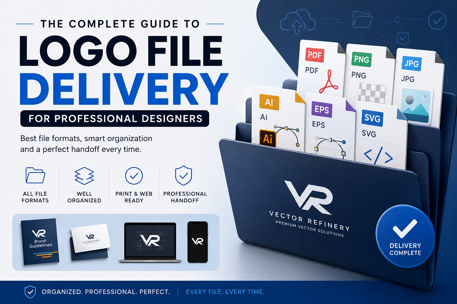
When a designer delivers a finished logo, the package should go well beyond a single file. At minimum, a complete professional delivery includes an editable vector master (AI or layered PDF/SVG), an EPS for print, an SVG for web use, and transparent PNGs in several sizes — ideally in both full-color and single-color versions.
Here is what a thorough, professional file package looks like in practice:
Vector master files — AI (editable source), EPS (print), SVG (web), vector PDF (sharing and print delivery)
Raster files — PNG in multiple sizes with transparent background, PNG with white background, JPG for simple previews only
Color variations — full color version, single-color black version, single-color white version, and grayscale if applicable
Color mode variations — RGB versions for digital use, CMYK versions for print use, and Pantone/spot color references where applicable
Logo orientation variations — horizontal lockup (best for website headers), vertical or stacked lockup (best for signage and collateral), and a standalone icon or brandmark version (useful for social media profile images, app icons, or situations where space is limited)
A logo that lacks any orientation variation altogether is also worth noting clearly — not every logo needs a vertical or icon-only version, but the designer should communicate explicitly which variations exist and which do not, rather than leaving the client to assume.
Color Modes: The Detail That Quietly Ruins Brand Consistency
One of the most common — and most damaging — mistakes in logo delivery has nothing to do with file format at all. It is color mode.
RGB is designed for screens. It produces a wider, more vivid range of colors than print can reproduce.
CMYK is the subtractive color model used in commercial printing, layering cyan, magenta, yellow, and black inks to produce all printable colors.
When an RGB file is sent to a commercial printer without proper conversion, the colors can shift significantly — sometimes dramatically. A vibrant RGB blue might print dull or noticeably purple. This is one of the most frequent causes of client complaints about “the colors looking wrong” after printing, and it has nothing to do with the printer’s competence and everything to do with which color mode was delivered.
Professional practice: Always provide separate CMYK versions of print-ready files, and confirm with the specific print vendor which CMYK profile they use — common standards include Fogra39 and SWOP, and profiles vary by region and printer.
Hex codes, for context, are not a true color profile — they are a six-digit shorthand notation primarily used in web and digital contexts (CSS, HTML) and cannot be embedded into vector files the way ICC color profiles can. Hex values should be documented in brand guidelines for digital consistency, but they are not a substitute for CMYK values in print files.
Folder Structure and File Naming: The Organizational Backbone
Receiving a dozen or more logo files at once can feel overwhelming for any client. A clean, logical folder structure transforms a confusing pile of files into something any team member can navigate confidently.
A simple, effective structure looks like this:
Your-Brand-Logo/
├── 01-Vector/
│   ├── AI/
│   ├── EPS/
│   ├── SVG/
│   └── PDF/
├── 02-Raster/
│   ├── PNG/
│   │   ├── Full-Color/
│   │   ├── White/
│   │   └── Black/
│   └── JPG/
└── 03-Brand-Guidelines/
Within each format folder, file naming should follow a consistent, descriptive structure rather than generic names like “logo_final_v2.ai.” A strong naming convention typically includes: the company name first, followed by the logo variation (for example, Horizontal or Icon), the color space (RGB, CMYK, or Pantone), and the color version at the end (Full Color, White, Black, Inverted).
An example of a properly named file: Acme-Horizontal-CMYK-FullColor.eps
This level of organization is not excessive — it is what separates a delivery that a non-designer client can navigate confidently from one that generates a flood of “which file do I use?” emails weeks after the project closed.
Backup practice: Store the complete delivered folder in at least two locations — a cloud storage service and a local backup. Losing source files means a client may have to pay to have their logo recreated from scratch, which is an entirely avoidable outcome with proper backup discipline.
Communicating File Formats to Non-Designer Clients
Most clients do not work with design files daily, and assuming they understand the difference between AI, EPS, and SVG sets up confusion and unnecessary back-and-forth. Part of professional file delivery is education, not just file export.
A short, plain-language guide included with every delivery solves this problem efficiently. It does not need to be elaborate — a simple one-page document or even a brief text file explaining each format and its primary use case is enough to dramatically reduce confused follow-up questions.
Cover, at minimum:
What each file format is for — a one-sentence, jargon-free explanation of AI, EPS, SVG, PDF, PNG, and JPG, written for someone with zero design background.
Which file to use for common scenarios — website, social media, print materials, signage, embroidery, email signature. Naming the actual use case rather than the format alone helps non-designers map their need to the correct file instantly.
Color mode basics — a brief explanation of RGB versus CMYK and why using the wrong one can shift colors unexpectedly in print.
A note on what never to do — most importantly, warning clients never to use a JPG for any printed or large-format application, and never to stretch or resize a raster file beyond its native dimensions.
This single document, included once per delivery, prevents the overwhelming majority of post-delivery format confusion and reflects well on the professionalism of the entire engagement.
When the Client Only Has a Raster File: The Vectorization Gap
Designers regularly encounter a specific, recurring problem: a client returns months or years after a project with only a low-resolution PNG, a JPG, or a screenshot of their logo — the original vector source files lost, never delivered, or created by a previous designer who is no longer reachable.
Without a vector source file, every future use of the logo is limited. Print jobs come out blurry. Embroidery digitizers cannot work cleanly from a pixelated reference. Large-format signage reveals visible pixelation at scale.
This is precisely the gap that professional manual vectorization services exist to close. Rather than recreating an entire logo from scratch — an expensive and time-consuming undertaking — a skilled vector artist can manually redraw the existing raster logo into a complete, accurate vector file package: AI, EPS, SVG, PDF, and PNG, properly separated by color and ready for any production use.
This is exactly the service Vector Refinery provides. Designers regularly use this service on behalf of clients who have lost their source files, freelancers who need a fast, reliable vectorization partner for client work, and agencies that need overflow capacity without hiring an in-house vector specialist. Every project is 100% manually redrawn — no auto-trace, no shortcuts — which means the resulting files meet the same professional standard a designer would expect from in-house work.
For a designer managing client relationships, knowing a reliable vectorization partner exists for these situations is itself a professional asset. It turns “I’m sorry, we don’t have your original files” into “Let me get you a clean vector version within 24 hours.”
Quick Reference: What File for What Job
Here is the decision framework every designer should be able to communicate instantly to a client or team member:
Website or web application — SVG, always. It is vector, lightweight, and renders sharply on every screen density.
Print materials (business cards, brochures, posters) — EPS or vector PDF, in CMYK color mode.
Large-format printing (banners, signage, vehicle wraps) — EPS or vector PDF. Never raster files of any kind, regardless of starting resolution.
Embroidery or digitizing — EPS or AI, with colors properly separated and ideally noted with Pantone thread-matching values.
Social media profile image or icon — PNG with transparent background, square-cropped icon version if available.
Email signature — PNG with transparent background, sized appropriately (typically under 300px wide to avoid bloating email size).
Sending to another designer for editing — AI, the native editable master file.
Quick preview or informal sharing — JPG is acceptable here and only here.
Laser cutting or engraving — vector AI, EPS, or DXF if the fabricator specifically requests it.
Logo File Delivery Mistakes Professional Designers Should Avoid
Delivering only a flattened PDF with no editable source. A PDF alone, without the underlying AI or layered SVG, leaves the client with no way to make even minor future edits without paying for a full recreation.
Forgetting to outline fonts before exporting EPS or AI files. If text remains as live type and the recipient does not have the same font installed, the file can render incorrectly or substitute a default font, breaking the design entirely.
Sending only RGB files for projects with known print intent. This is one of the most common and most consequential oversights — the client receives beautiful files on screen, only to be disappointed when the printed colors do not match.
Skipping the single-color (black/white) versions. Many real-world applications — stamps, engraving, single-color embroidery, fax cover sheets, certain print processes — require a one-color version. Omitting this from the delivery forces an unnecessary follow-up request.
No clear naming convention. Files named “final,” “final2,” and “final_USE_THIS” create confusion and erode client confidence regardless of how good the underlying design work is.
Assuming the client understands vector versus raster. Even sophisticated clients in non-design fields often do not know why a PNG looks blurry on a banner. A brief explanation included with delivery prevents misuse and protects the brand’s visual quality.
Making Logo File Delivery for Professional Designers a Repeatable Process
The most reliable way to avoid these mistakes is to build a repeatable, standardized file delivery process rather than improvising it at the end of every project. Many established design studios maintain a template folder structure, a standard naming convention, and a one-page client-facing format guide that gets customized and reused for every engagement.
This approach has two clear benefits. First, it removes the cognitive load of deciding the delivery structure fresh for every project, which saves real time on what is often a tedious final step. Second, and more importantly, it creates a consistent, professional client experience that reinforces the value of the design work itself. A logo delivered in a disorganized, incomplete file dump undercuts even excellent creative work. A logo delivered in a clean, complete, clearly labeled package reinforces it.
Final Checklist Before Every Delivery
Before sending any logo package to a client, confirm the following:
The AI master file is included and properly layered. The EPS file has all text outlined. An SVG version is included and tested by opening directly in a browser. A vector PDF is included for easy sharing and approval. CMYK versions exist for any file intended for print. PNG files are provided at multiple sizes with transparent backgrounds. Single-color black and white versions are included. Files are organized into a logical folder structure with consistent naming. A brief plain-language guide to the file formats is included for the client. The complete package is backed up in at least two separate locations.
A delivery that checks every item on this list reflects the same level of craft and professionalism as the design work itself — because to the client, it is the same thing.
Frequently Asked Questions
What is the minimum file set I should deliver for any logo project? At minimum: an editable vector master (AI or layered PDF/SVG), an EPS for print, an SVG for web, and transparent PNGs in several sizes, ideally in both full-color and single-color versions.
Is EPS still necessary in 2026, or has PDF replaced it? EPS is still widely requested, particularly by print vendors and embroidery digitizers using established workflows. While some vendors increasingly prefer PDF for its flexibility, EPS should still be included in every professional delivery to avoid compatibility issues.
What should I do if a client lost their original vector files? A professional manual vectorization service can rebuild a clean vector file package from any raster source the client still has — even a low-resolution PNG or screenshot. This is significantly faster and more affordable than recreating the logo design from scratch.
Should I always provide Pantone color values? Pantone values are valuable for clients with specific spot-color print needs, such as embroidery or branded merchandise. They are not strictly necessary for every project, but should be offered when the client’s use case calls for precise color matching across vendors.
How many file formats is too many to deliver? There is no fixed upper limit, but organization matters more than quantity. A well-structured folder with ten files is far more useful to a client than three files with no clear labeling or explanation of which to use where.
Do I need to provide both horizontal and vertical logo versions? Not every logo design calls for multiple orientations, but it is worth considering for clients who will use the logo across varied contexts — website headers typically favor horizontal lockups, while signage and social profiles often favor vertical or icon-only versions.
Published by Vector Refinery — Professional Manual Logo Vectorization and File Conversion Service. Visit vectorrefinery.com for fast, reliable vectorization support for designer and agency client work.
