
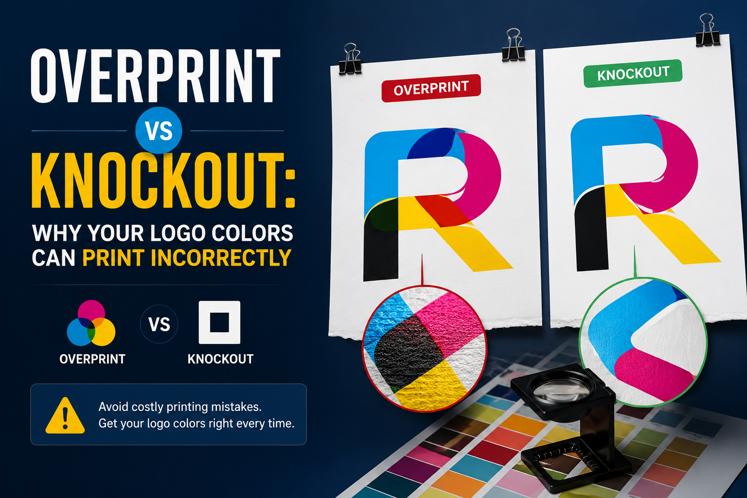
Overprint vs knockout logo colors print incorrectly more often than most designers realize — and the wrong setting in a single element is all it takes to make white text disappear or brand colors turn muddy on press.
Overprint and knockout are fundamental concepts in print production that dictate how colors interact when printed on top of each other. Overprinting means that the colors will mix, while knockout tells the printer to remove the underlying color, preventing any mixing. The impact of getting these wrong is significant — it causes disappearing text, unintended color mixing, and expensive reprints that were entirely preventable with a single settings check.
This guide explains what overprint and knockout actually do, when each is correct, what the most common failure modes look like, and how to verify your logo files before they reach the press.
How Commercial Printing Creates Color
Before understanding overprint and knockout, it helps to understand how offset and screen printing produce color physically.
Commercial printing does not work like a computer screen, where every pixel is independently controlled. In offset printing, each color is printed as a separate pass through the press — one plate for cyan, one for magenta, one for yellow, one for black. In spot color printing — which is what most logo work uses — each Pantone color is a separate ink pass through a separate plate or screen.
This separation-based process creates a fundamental question that does not exist in digital design: what happens where two ink colors overlap? On a screen, overlapping colors is easy — the program renders the visual result. On a printing press, the question is physical. Do you print both inks on top of each other, mixing them? Or do you cut a hole in the bottom color so only the top color prints there?
The answer to this question is what overprint and knockout control.
What Knockout Is (and Why It Is the Default)
Knockout is the default setting that makes overprint vs knockout logo colors print correctly in the vast majority of production situations.
Knockout is the default behavior in virtually all professional print software. When colors are set to knockout, the top color element cuts a hole — a knockout — in any color elements below it. The printer only applies ink in the non-overlapping areas of each color, ensuring that wherever two colors would overlap, only the top color prints.
When you want things to overlap, the object on top must be set to overprint instead of knockout. When normally setting up files with one color on top of another, the color underneath gets knocked out by the printer, meaning no colors get mixed. This knocking out process prevents colors from mixing and getting muddy or overly saturated. The printer will not print any parts of objects that lie underneath other objects.
Think of it visually. If you have a red circle with a yellow star on top, knockout means a yellow-star-shaped hole is cut out of the red circle’s print area. Only yellow ink prints in the star shape. Only red ink prints in the surrounding area. The two inks never overlap, so they never mix.
This produces clean, accurate colors that match what was designed. Knockout is correct for the vast majority of logo printing situations.
With knockout, the element on the bottom ends up with a hole in the exact shape of the element above, and the element above is fitted inside this hole. This is the default and usually the correct setting for clean, accurate color reproduction.
What Overprint Is (and When It Goes Wrong)
Overprinting is the opposite of knockout. When an element is set to overprint, it prints on top of whatever color is beneath it without knocking out the background. Both inks — the one below and the one on top — are present in the overlap area, and they mix.
Overprinting should be avoided when printing light colors over dark colors, as this can lead to unwanted color mixing and a loss of vibrancy. For example, printing white text over a rich black background using overprint will result in the white disappearing entirely — because white ink overprinted on black simply disappears into the black.
This is the classic overprint disaster scenario: white text set to overprint on a dark background. White ink cannot overprint onto any other ink and remain visible — the result is the white simply not printing where the background exists, making the text invisible. A designer approves a clean mockup showing white text on a black panel. The file goes to press. The white text is set to overprint. The text disappears entirely on the printed piece.
The problem is that design software like Adobe Illustrator displays files on an RGB screen, which simulates all colors independently. The screen shows white text on a black background looking exactly correct. The overprint setting is invisible in normal view. The problem only becomes visible when the file reaches prepress and the color separations are checked — or, more expensively, when the physical print comes off the press.
The Most Common Overprint and Knockout Problems in Logo Files
These are the overprint vs knockout logo colors print failures that appear most frequently in professional production workflows. Several specific failure modes appear repeatedly in logo printing because of incorrect overprint or knockout settings.
White text or elements disappearing
This is the most dramatic and most common overprint failure. White elements — text, shapes, reversed logos — set to overprint on any dark background simply disappear when printed. White ink cannot mix with dark ink and remain visible. The overprint setting tells the press to apply white ink on top of the background color, but the optical result is that the white is invisible.
The fix is straightforward: white elements must always be set to knockout. White knocks out the background color so that no ink at all is applied in the white areas — the paper itself shows through, producing a white result.
Color mixing producing muddy or wrong hues
When two colors overprint instead of knockout, they mix at the point of overlap. A yellow logo element overprinting onto a blue background produces green where they overlap — not yellow on blue. The formula is simple: the inks mix like pigments. Yellow plus blue equals green. Cyan plus yellow equals green. Magenta plus cyan equals blue.
For logos where color accuracy is critical — brand colors with specific Pantone references that must reproduce consistently — an accidental overprint setting can produce a completely wrong color at the overlap area. The mixed color may look like a completely different hue from the intended brand color.
Rich black behaving unexpectedly
Rich black — a deep black produced by combining CMYK values (typically 60C/40M/40Y/100K) rather than using 100% K alone — requires careful overprint handling. Black elements are often set to overprint by default in InDesign and Illustrator because 100% K black overprinting slightly onto adjacent colors is generally not a visible problem and avoids registration gaps at black element boundaries.
However, rich black set to overprint produces a very dark, saturated color blend wherever it overlaps other elements — sometimes causing unexpected color shifts at the edges of black logo elements. For logos where black elements border other brand colors, rich black overprint behavior needs to be checked explicitly.
Registration gaps where overprint should be used
Knockout creates a clean boundary between colors — but those clean boundaries require perfect registration between color plates on press. When press registration is not perfect, tiny gaps appear between adjacent knockout color areas. These gaps — hair-thin strips of unprinted paper showing through between colors — are called misregistration gaps.
When colors overlap and are knocked out, the margins on different separation plates may be misaligned, resulting in gaps between colors. In some cases, such gaps can be avoided by using overprinting to avoid the creation of knockout regions.
For logos with adjacent colors that need to align precisely — a logo where two colors meet at a clean edge — slight overprint or trapping of the boundaries prevents these gaps from being visible even when press registration is imperfect. This is a more advanced technique than basic overprint/knockout, but it is why experienced prepress operators often add trapping to logo files before press.
How to Check Overprint Settings in Adobe Illustrator
Checking overprint vs knockout logo colors print settings before submission takes five minutes and prevents the most common — and most expensive — print failures.
The most important tool for catching overprint problems before they reach the press is Overprint Preview mode.
In normal view, Adobe Illustrator displays all colors as they appear on an RGB screen — independently, without any ink mixing simulation. Overprint settings are invisible in normal view. A white element set to overprint looks perfectly correct on screen.
Overprint Preview mode simulates what will actually happen in print. To enable it in Illustrator: go to View → Overprint Preview. With Overprint Preview active, any element set to overprint will display its mixed color result on screen — including white elements that will disappear, and colors that will mix unexpectedly.
The overprint preview feature shows how colors will interact when printed. Always activate this when finalizing print layouts to avoid unwanted surprises.
The steps to verify logo files before submission:
Step 1 — Enable Overprint Preview. View → Overprint Preview. Check that white elements are still visible. Check that colors at overlap areas look correct. Any element that disappears or shows an unexpected color has an overprint problem.
Step 2 — Check element overprint settings. Select each element in turn and open the Attributes panel (Window → Attributes). The Overprint Fill and Overprint Stroke checkboxes show whether each element is set to overprint. White elements should have both unchecked. Black text on colored backgrounds may appropriately have Overprint Fill checked. Any other element set to overprint needs to be justified.
Step 3 — Check the Separations Preview. Window → Separations Preview. Toggle individual color plates on and off to see how the file separates. If turning off the black plate makes white text disappear, the white is not actually printing — it is set to overprint.
To check if objects are set to 100K overprint versus knockout: Open the PDF in Acrobat, go to Preferences → Page Display, enable Use Overprint Preview: Always. Then open Output Preview (Tools → Print Production), toggle Simulate Overprinting, and in the Separations list turn off C, M, Y to check if 100K text remains. If it disappears, it is not set to overprint.
Overprint vs Knockout in Spot Color and Screen Printing
The overprint vs knockout question takes on additional importance in spot color printing — which includes screen printing, the most common method for logo work on apparel and merchandise.
In spot color screen printing, each color is a separate ink pass through a separate screen. The overprint vs knockout decision determines how the color separations are set up and directly affects what the screens look like.
Screen printing layers particularly benefit from strategic overprinting. The technique simplifies color build and improves registration across multiple screens.
For logos with overlapping elements in different spot colors, knockout is the standard approach — each color knocks out the area where adjacent colors will print, so the colors do not mix and muddy on the garment. For logos where overprinting specific elements is intentional — using the optical mixing of screen printing inks to produce an additional color from two existing spot colors — overprint can be used deliberately.
The key difference from offset printing is that screen printing inks behave somewhat differently when overprinted. Plastisol inks, the most common screen printing ink, are more opaque than offset inks. When overprinted, the top ink may largely cover the bottom ink rather than mixing optically. For transparent or reduced-opacity inks, the mixing effect is more pronounced. The specific result depends on ink type, mesh count, and ink volume — which is why it is always worth discussing intentional overprinting with the specific screen printing shop before finalizing files.
The Trapping Solution: Between Overprint and Knockout
Trapping sits between pure overprint and pure knockout as a solution to the registration gap problem.
Trapping involves slightly expanding one color into an adjacent color by a small amount — typically 0.25pt to 0.5pt — creating a tiny overlap zone that prevents registration gaps from being visible. The expanded overlap area is usually the lighter of the two adjacent colors, which minimizes the visual impact of any color mixing in the overlap zone.
Fine lines and thin vector elements benefit from overprinting. Any line thinner than 0.25pt should typically overprint to prevent disappearance due to misregistration.
For logos going to professional offset printing, trapping is typically handled by the print shop’s prepress team rather than by the designer. For screen printing, the shop’s color separation team handles the equivalent setup. What matters from a file preparation standpoint is that the logo file is submitted with correct overprint and knockout settings — the underlying geometry correct — so the prepress team can work from a clean foundation.
How Auto-Traced and Poorly Constructed Vector Files Create Overprint Problems
One of the ways overprint and knockout problems enter logo files is through auto-traced artwork and poorly constructed vectors.
When a logo is auto-traced — converted from a raster image using auto-trace software — the resulting color regions may have overlapping paths with incorrect overprint settings inherited from the trace process. Auto-trace creates overlapping shapes where clean knockout boundaries should exist, and may set unexpected overprint attributes on those overlapping areas.
A professionally manually redrawn logo has color regions that are explicitly separated — each color is its own clean, non-overlapping closed path. There are no accidental overlaps and no inherited overprint settings from a raster trace. The overprint and knockout settings start from the correct defaults and only deviate when there is a specific production reason to do so.
This is one reason why professionally redrawn vector files consistently perform better at press than auto-traced equivalents. The manual rebuild process produces clean color separation that gives the print shop’s prepress team a correct foundation — not a tangle of overlapping auto-traced paths with incorrect overprint attributes.
Vector Refinery provides professionally manually redrawn logo files with clean, non-overlapping color regions and correct default overprint settings. Every file is delivered in AI, EPS, SVG, and PDF formats — ready for prepress review and production.
Get your logo print-ready in 24 hours
Upload your PNG, JPG, or screenshot. A free assessment with exact price and turnaround is included before you pay anything.
Quick Reference: When to Use Overprint vs Knockout
| Situation | Correct setting | Why |
|---|---|---|
| White text on dark background | Knockout | White overprinted on dark disappears |
| Light color on dark background | Knockout | Overprint mixes colors — light color lost |
| Black text on colored background | Overprint (100% K only) | Prevents registration gaps at text edges |
| Rich black on colored background | Knockout | Rich black overprint creates color mudding |
| Adjacent logo colors at clean boundaries | Knockout + trapping | Prevents registration gaps without mixing |
| Intentional color mix effect | Overprint | Deliberate transparency or blend effect |
| Reversed logo (logo out of background) | Knockout | Background knocks out in logo shape |
| Thin lines adjacent to other colors | Overprint | Prevents disappearance from misregistration |
Frequently Asked Questions
Why did my white logo text disappear in the printed job? White text set to overprint prints directly on top of the background color and becomes invisible because white ink cannot be seen over any other ink. The fix is to set white elements to knockout in the Attributes panel in Illustrator, and verify using Overprint Preview before submitting the file.
How do I check if my logo file has overprint problems? In Adobe Illustrator, go to View → Overprint Preview. Any element set to incorrectly overprint will display its actual print result — including white elements that disappear and colors that mix unexpectedly. Also check each element’s Attributes panel for the Overprint Fill and Overprint Stroke settings.
Is overprint always wrong? No. Overprint is intentionally correct in some situations — 100% K black text on colored backgrounds often uses overprint to prevent registration gaps, and intentional transparency and color blend effects use overprint deliberately. The problem is unintentional overprint on white elements or light colors where it causes disappearance or unintended mixing.
What is the difference between overprint and trapping? Overprint means an element prints on top of the background without knocking it out, causing color mixing. Trapping is a technique that creates a tiny overlap between adjacent colors to prevent registration gaps without causing full overprint color mixing. Trapping is usually handled by the print shop’s prepress team.
Why does my logo look correct on screen but wrong when printed? Design software displays files on RGB screens where overprint settings are invisible in normal view. Overprint Preview mode simulates the actual print result. If the file looked correct on screen but wrong in print, enable Overprint Preview, find the incorrectly set elements, and fix their overprint settings before resubmitting.
Does screen printing have overprint and knockout? Yes, the same principles apply. In screen printing, knockout means each color’s screen has the overlapping areas of adjacent colors removed. Overprint means both colors print in the overlap area and mix on the garment. For accurate logo color reproduction, knockout is almost always the correct setting for spot color screen printing.
Getting overprint vs knockout logo colors print settings right is one of the simplest and most impactful quality checks in professional logo file preparation.
External Resources
- Adobe Illustrator Overprinting Guide — official documentation on overprint settings in Illustrator (April 2026)
- Printing for Less Overprint Preview Guide — how to check before printing (May 2026)
- Delight Ad Overprint vs Knockout Brand Color Guide — brand color implications (December 2025)
- Design Your Way Overprint vs Knockout — designer’s practical guide (June 2025)
Published by Vector Refinery — Professional Manual Logo Vectorization and Print-Ready File Preparation Service. Visit vectorrefinery.com to upload your logo and get a free assessment today.
