
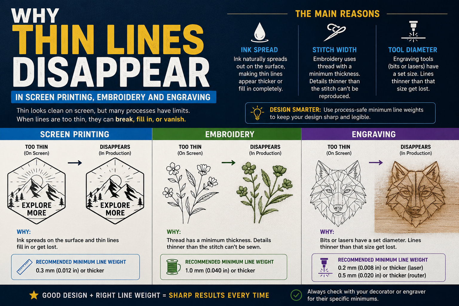
Thin lines disappear screen printing embroidery engraving — and the root cause is always the same hard physical limit, not a bad file or a machine error. Thin lines disappear in screen printing, embroidery, and engraving every day — and in every case the root cause is the same. Not a bad file. Not a machine problem. Not a mistake by the production team. The lines are simply below the physical threshold of what the production method can reproduce.
Most reprints do not come from a press failure. They come from artwork that was never going to hold at production size: a hairline rule that vanishes, small text that fills in, a reversed logo whose gaps close up. What looks crisp at 400% on a monitor is not what the machine can resolve on a garment, a mug, a trophy, or a sign.
Understanding why this happens — and what the actual minimums are for each production method — is one of the most practical things a designer or brand manager can know. This guide covers every production method, every relevant minimum, and how to prepare artwork that survives each one.
Why Physical Limits Exist at All
The common thread across screen printing, embroidery, and laser engraving is that each one involves a physical medium with a minimum resolution that no amount of artwork preparation can overcome.
Every decoration method has a physical floor. Screen printing pushes ink through a mesh, so a line thinner than what the mesh can hold simply breaks up. Laser engraving burns a channel that has width and depth, so fine strokes lose definition. Embroidery lays thread with real thickness, so small letters turn into knots.
This is why the “it looks fine on screen” explanation is so frustrating in production conversations. A screen at 72 or 96 DPI can display detail that no physical medium can reproduce. A hairline stroke in Illustrator is technically 0.25pt — approximately 0.09mm. No screen printing mesh, no embroidery needle, and no standard laser beam can reproduce that. The artwork needs to be redesigned for the medium, not just exported.
Screen Printing: Why Thin Lines Disappear
Screen printing works by pushing ink through a fine mesh screen. The mesh has a specific thread count — typically measured in threads per inch or threads per centimeter. The thread count determines how fine a detail the screen can hold. Below that threshold, ink does not pass through cleanly — it either cannot pass at all, or it bleeds across the mesh threads and produces a blurry, undefined edge instead of a clean line.
For clean output, keep lines at or above 1pt for screen and pad printing. Most reprints in screen printing do not come from press failures — they come from artwork with hairline strokes that the mesh physically cannot reproduce.
Minimum Line Width: 1pt (0.35mm)
The practical minimum for reliable line reproduction in standard spot color screen printing is 1pt, which is approximately 0.35mm. Lines below this threshold either fill in completely (appearing as a solid area rather than a defined line), break up into inconsistent ink coverage, or disappear entirely depending on the mesh count and ink viscosity.
Reversed Lines Need More Room
Reversed, or knockout, artwork is significantly more demanding than positive artwork. When a design is the negative space — white or light lines cutting through a darker background — ink spread closes the gaps between the elements. A 1pt white line in a reversed design may close completely when the surrounding ink spreads slightly during printing.
Reversed art needs more room. The practical minimum for reversed line work in screen printing is typically 1.5pt to 2pt to account for the ink spread that closes knockout gaps.
Halftones and Fine Detail
Photographic detail and gradients in screen printing are reproduced using halftone dots — tiny ink dots of varying sizes that create the impression of different shades. Fine halftones are sensitive to mesh count. A 45-line halftone on a 160 mesh screen reproduces reliably. Pushing to finer halftones on the same mesh produces muddy, inconsistent results.
For logos and brand marks — which should use flat, solid colors rather than halftones — this is less relevant. But for complex artwork with shading or photographic elements, the halftone limitation means some of the visual complexity visible on screen will not survive the production process.
Text Minimums in Screen Printing
Keep text at or above 8pt for screen printing. At smaller sizes, counters — the enclosed spaces inside letters like O, A, P, B, and D — close up with ink spread, and thin strokes within letterforms fill in, making text illegible. Serif fonts at small sizes are especially vulnerable because the thin serifs disappear before the thick strokes.
Embroidery: Why Thin Lines Disappear
Embroidery has the most demanding minimum size requirements of any production method discussed here, because thread is a physical object with a real diameter.
A standard embroidery needle is approximately 0.3mm wide. Thread is thicker still — most embroidery thread is 0.5mm to 0.8mm in diameter. A line that looks crisp on screen becomes a single stitch on fabric. Text height minimum 0.25 inches (6.4mm). Smaller text merges into illegible blobs — this is called “sewing shut.” Line weight minimum 0.04 inches (1mm). Thinner lines disappear into the fabric texture.
Minimum Line Width: 1mm (approximately 2.8pt)
The minimum reliable line width for embroidery is 1mm. Below this, the thread physically cannot follow the intended path at the required precision. Lines below 1mm either disappear into the fabric texture (particularly on textured fabrics like pique polo shirts), merge with adjacent elements, or produce uneven, broken coverage that looks nothing like the original design.
This is not a setting or a preference. It is the physical consequence of thread having a real diameter. A stroke in a vector file can be 0.1pt — mathematically — but thread cannot be embroidered at that width because thread is not pixels.
Minimum Text Height: 6.4mm (0.25 inches)
The minimum text height for clean, legible embroidery is 6.4mm — approximately 0.25 inches — measured as the cap height of the letterform. Below this threshold, the counters inside enclosed letters sew shut, thin strokes within letterforms merge into thicker ones, and the text becomes a mass of thread rather than readable characters.
For embroidery on caps — where the available area is smaller and the structured fabric creates additional precision constraints — the practical minimum is closer to 7.6mm (0.3 inches) because the curved, stiffer cap bill limits how precisely the machine can follow fine paths.
The Left-Chest Constraint
The standard left-chest embroidery area is approximately 3.5 inches wide. This is where most logo problems are discovered. A logo that looks fine at large scale on a screen has to work at 3.5 inches wide on fabric. Every element of the logo needs to meet minimum size requirements at this scale — not at the scale it was designed.
A practical test: reduce your logo to 3.5 inches wide on your screen before submitting it for embroidery. Whatever details disappear or become unclear at that size will not embroider cleanly.
Avoid Thin Serif Fonts and Script Under 4mm
For embroidery, avoid thin serif fonts or script under 4mm tall. The hairline strokes that give serif typography its elegance are below the minimum embroidery line width at typical garment sizes. Script fonts with thin connecting strokes between letters have the same problem — the connecting elements fill in or disappear, and the text reads as a jumble rather than flowing script.
Bold, clean, sans-serif typography with consistent stroke weights embroideries most reliably. If your brand uses a delicate serif or script typeface, an embroidery-specific simplified version of the logo may be necessary.
Gradients and Shading
Embroidery has no direct equivalent of a gradient. Thread is a solid color. Gradient effects in embroidery are simulated through techniques like varying stitch density or alternating thread colors in a pattern — but these are approximations that look noticeably different from a smooth digital gradient. For logos with gradients, the embroidery version needs flat, solid colors.
Laser Engraving: Why Thin Lines Disappear
Laser engraving burns material away using a focused beam of light. The minimum feature size in laser engraving is determined by the spot size of the laser beam — the width of the focused beam at the point of contact with the material. Below that spot size, the laser physically cannot produce a narrower burn.
For clean output, keep lines at or above 1pt for laser engraving and text at or above 10pt. Black-and-white vector art works best for laser engraving; shades of gray will engrave as different depths.
Minimum Line Width: 1pt (varies by machine)
The minimum practical line width for laser engraving is approximately 1pt — but this varies significantly by machine. A high-precision fiber laser operating at 20 watts with a fine focus lens can engrave finer detail than a desktop diode laser. Most commercial CO2 laser engravers work with a beam spot size of approximately 0.1mm to 0.3mm — meaning lines at or near this width are at the edge of what can be reliably reproduced.
Below the minimum, two things happen: the line either burns wider than intended (because the laser beam overlaps the edge of the intended stroke and chars the surrounding material), or the line does not engrave cleanly at all (because the laser beam cannot focus tightly enough to follow the path accurately).
Minimum Text: 10pt for Laser Engraving
Text for laser engraving should be at or above 10pt. Below this size, thin strokes within letterforms are below the laser’s minimum feature size, causing them to either disappear or merge with adjacent strokes. At small sizes on materials like anodized aluminum or coated metal, even 10pt text can be challenging — going to 12pt or larger is safer for guaranteed legibility.
Material Effects on Line Quality
The material being engraved significantly affects what minimum line widths are practical. Wood is forgiving — the organic texture of wood grain absorbs slight variations in burn width, and fine lines engrave more reliably than the theoretical minimums suggest. Metal is less forgiving — the hard, reflective surface shows every imprecision in the burn, and lines at or near the minimum look rough rather than clean. Acrylic produces clean, crisp results at minimum sizes — the material responds predictably to laser energy, and fine detail engravable reliably down to the laser’s actual beam spot size.
Vector vs Raster Engraving for Fine Lines
Fine lines in logos are best engraved as vector paths — the laser traces the path outline at low power, producing a precise scored line. Raster engraving — where the laser moves back and forth across the surface burning pixels — produces less precise results for fine line work because the line width is determined by the raster scan resolution and the laser spot size, not by a precise vector path.
For logos with fine lines intended for engraving, submit vector files with the lines as vector paths (not filled shapes), color-coded for vector engraving operation in the laser software’s convention.
The Reversed Artwork Problem
Every production method has an additional challenge with reversed, or knockout, artwork — designs where the logo appears as light elements on a dark background, or where fine white lines cut through dark fills.
In screen printing, ink spreads slightly as it is pushed through the mesh. On positive artwork — dark ink on a light background — this spread makes lines appear slightly thicker than designed, which is usually not a problem. On reversed artwork — light gaps in dark areas — the spreading dark ink closes the gaps, making reversed fine lines disappear or fill in.
In embroidery, the same principle applies. The thread bulk fills small spaces. Fine reversed lines — thin light gaps in a dark embroidered area — are particularly vulnerable to filling in as adjacent stitches push against each other.
The practical rule across all methods: reversed artwork needs minimum widths approximately double those for positive artwork. A 1pt minimum for positive screen printing becomes a 2pt minimum for reversed elements in the same design. A 1mm minimum line for positive embroidery becomes a 2mm minimum for reversed line work.
How to Check Your Artwork Before Production
The fastest way to identify thin line problems before they reach production is to simulate production conditions during artwork review.
Screen printing check: Reduce the artwork to the intended garment size on screen. Select all elements and check stroke weights in Illustrator’s Stroke panel. Any stroke below 1pt (or 2pt for reversed elements) needs to be thickened.
Embroidery check: Reduce the artwork to 3.5 inches wide — the standard left-chest size. At this scale, anything that looks uncertain, unclear, or too fine will not embroider cleanly. Specifically check: text legibility at this size, line weight visibility, and the clarity of any fine decorative elements.
Laser engraving check: Zoom to 400% in Illustrator or your design software. At this zoom level, any line that looks thin or uncertain is likely at or below the laser’s minimum feature size. For text, verify the cap height of the smallest text element at the intended engraving scale.
All methods: Run a preflight check specifically for stroke weight. In Illustrator, you can create a custom action that selects all elements with strokes below your defined minimum. The better approach is to build this check into the artwork preparation workflow so it happens before every production submission.
The Fix: Thickening Lines for Production
The solution to thin line problems is straightforward but must be done correctly in the vector file before submission.
Thickening strokes: Select all thin strokes in the file and increase the stroke weight to meet the production minimum. For screen printing: 1pt minimum. For embroidery: 1mm (approximately 2.8pt) minimum. For laser engraving: 1pt minimum at the intended engraving size.
Expanding strokes: After thickening, consider expanding the strokes to outlines (Object → Expand in Illustrator). This converts strokes to filled shapes, which handles more predictably in some production workflows and eliminates the risk of stroke weight being interpreted differently by the production software.
Simplifying reversed elements: For reversed artwork, any gap or knockout below double the production minimum should be widened or eliminated. Fine reversed hairlines that are below the threshold need to be either thickened to the minimum or converted to positive elements.
Creating a production-specific version: When a logo has elements that cannot be thickened without significantly changing the visual character of the design — very delicate letterforms, intentionally hairline decorative elements — the right approach is creating a separate production version of the logo specifically for each medium. The print version, the embroidery version, and the engraving version may look slightly different from each other, but each one will perform correctly in its intended production context.
When to Use Professional Vectorization for Thin Line Logos
Logos with thin lines — whether by design or because they were auto-traced from a raster image with anti-aliased edges — often need professional manual attention before they are ready for any of these production methods.
Auto-traced vectors commonly produce strokes that are technically present in the file but below production minimums, because the auto-trace algorithm follows pixel edges that are inherently thinner than what any physical medium can reproduce. A professionally manually redrawn vector file has stroke weights that are deliberately set for production — the artist understands the production context and sets line weights accordingly.
When a logo file is submitted for vectorization to Vector Refinery and the intended use is screen printing, embroidery, or engraving, the artist applies the relevant minimums as part of the redraw process. Strokes are drawn at production-appropriate widths. Text is rebuilt at sizes that will hold in the intended medium. Fine decorative elements below the production minimum are flagged and discussed before delivery.
The Standard package at $45 delivers a complete file set with all elements correctly constructed for general production use. For applications with specific minimum size requirements — embroidery optimization, laser cutting file preparation — the Premium package at $85 includes the additional review and adjustment work specific to those applications.
Get your logo print-ready in 24 hours
Upload your PNG, JPG, or screenshot. A free assessment with exact price and turnaround is included before you pay anything.
Minimum Size Quick Reference
Here are the production minimums across all three methods for fast reference:
Screen printing — positive artwork: Minimum line width: 1pt (0.35mm). Minimum text size: 8pt cap height.
Screen printing — reversed/knockout artwork: Minimum line width: 2pt (0.7mm). Minimum gap width: 2pt. Minimum text size: 10pt cap height.
Embroidery — standard apparel: Minimum line width: 1mm (2.8pt). Minimum text height: 6.4mm (0.25 inches) cap height. Minimum gap between elements: 1mm.
Embroidery — cap embroidery: Minimum text height: 7.6mm (0.3 inches). All other minimums same as standard apparel.
Laser engraving — standard CO2 laser: Minimum line width: 1pt at engraving size. Minimum text size: 10pt at engraving size.
Laser engraving — reversed/deep engraving: Minimum line width: 2pt at engraving size. Minimum text: 12pt.
Frequently Asked Questions
Why do thin lines look fine on screen but disappear in print or production? Screens display at 72 or 96 pixels per inch and can render detail that no physical production medium can reproduce. A hairline stroke of 0.25pt looks crisp on a monitor but is approximately 0.09mm — far below the minimum for any screen printing mesh, embroidery needle, or standard laser beam. The screen is showing you a rendering, not what the physical medium will produce.
What is the minimum line width for screen printing? The practical minimum for reliable reproduction in standard spot color screen printing is 1pt (approximately 0.35mm) for positive artwork and 2pt for reversed or knockout artwork. Lines below these thresholds either disappear, fill in, or produce inconsistent coverage depending on mesh count and ink viscosity.
What is the minimum line width for embroidery? The minimum reliable line width for embroidery is 1mm (approximately 2.8pt or 0.04 inches). Below this, the thread — which has a real physical diameter of 0.5mm to 0.8mm — cannot follow the intended path at the required precision. Lines below 1mm disappear into fabric texture or merge with adjacent elements.
Why does text fill in when embroidered? Small text fills in because the enclosed spaces within letterforms — the counters inside O, A, B, P, and D — close up when thread fills the surrounding area. The minimum text height for clean, legible embroidery is 6.4mm (0.25 inches). Below this, letters merge into solid shapes rather than reading as characters.
How do I check if my logo has lines that are too thin for production? In Adobe Illustrator, select all elements and check stroke weights in the Stroke panel. Anything below 1pt for screen printing or 2.8pt for embroidery needs to be thickened. Also reduce the artwork to the intended production size on screen — at 3.5 inches wide for a left-chest embroidery, for example, any element that looks uncertain or unclear will not produce cleanly.
Can I just increase stroke weight in my existing vector file? Yes, but verify the result after thickening. Simply increasing stroke weight can make shapes overlap where they previously had designed gaps between them, changing the visual balance of the design. Review the file at production size after thickening and confirm the result is visually correct before submitting.
Published by Vector Refinery — Professional Manual Logo Vectorization Service. Visit vectorrefinery.com to upload your logo and get a free assessment today.
