
White underbase screen printing logo work is the single most important step that separates a vivid, accurate result on a dark garment from a dull, muddy disappointment. It is also the step that cheap shops are most likely to skip — because it costs them time, requires an extra screen, and slows down the press.
If you have ever approved a design mockup on screen — bright reds, clean whites, sharp blues on a black tee — and then received shirts where the colors looked muted, washed out, or completely wrong, you have experienced what happens when underbase is skipped or cut short. This guide explains exactly what white underbase is, why it matters for your logo specifically, when you need it, when you do not, and what to look for in a print shop that handles it correctly.
What Is White Underbase?
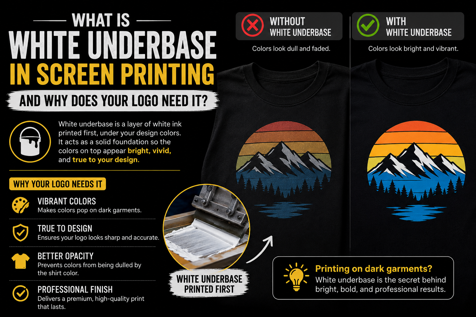
In screen printing, a white underbase refers to a layer of white ink printed as a base layer on dark garments or fabrics before applying other print colors. It is commonly used to ensure that the colors printed on dark shirts or garments appear vibrant and accurate to their intended hue.
The analogy that explains it best comes from house painting. Think of painting a dark wall white. If you just slap white paint on a black wall, the black shows through and the white looks gray. You need a coat of primer first to block the dark color, then the white paint on top looks bright and clean. Screen printing on dark garments works the same way. Most textile inks are semi-transparent — they are designed to let the fabric color influence the final appearance, which is great on white shirts but terrible on dark ones.
A white underbase is nothing more than a white spot color print in the shape of the artwork for which the color is intended. It is printed first to provide a base for the colored ink to rest on. The underbase is flash cured before the remaining colors are printed. The underbase will actually fill the knit some and keep the colored ink to be printed on top from soaking into the fabric of the shirt, thus keeping its intensity and coverage ability.
In simple terms: the white underbase is a layer of opaque white ink, shaped exactly like your logo, printed onto the garment first. Once it is partially cured with a flash dryer, your logo colors are printed on top. The result is that your colors sit on a white foundation rather than directly on dark fabric — and they look the way they were designed to look.
Why Dark Fabric Kills Logo Colors Without Underbase
Many screen printing inks are not fully opaque on their own. When ink goes directly onto a dark shirt, the garment color bleeds through and changes what you see. For example, a bright yellow printed straight onto black becomes muddy, light blue on navy practically disappears, and pastel tones on dark fabric can vanish almost entirely. Bright colors on a white shirt look exactly as they should because the fabric is already acting as the base, while on a black or darker shirt, those bright colors need something to sit on that isn’t black. That’s where white underbases come in.
This is the physics of pigment-based inks on textile. Screen printing inks — particularly plastisol, the most common type — are designed with some transparency. On a white or light garment, that transparency is not a problem because the fabric itself acts as a bright base. On a dark garment, the transparency means the dark fabric color mixes with the ink color, producing a result that is darker, duller, and less accurate than what was designed.
A base (underbase) is essential when printing on dark garments, as it provides a foundation layer for colors to appear vibrant and accurate. Without an underbase, inks can become dull or shift in tone due to the garment color showing through.
The shift is not subtle. A fire-engine red on a black shirt without underbase prints as a dark maroon. A sky blue becomes nearly invisible on navy. These are not printing errors — they are the predictable result of semi-transparent inks interacting with dark fabric. The underbase prevents this by providing an opaque white layer that blocks the dark fabric color before the logo colors are applied.
How the White Underbase Process Works Step by Step
Understanding the production process helps you evaluate whether a print shop is handling underbase correctly — and what to ask when placing an order.
Step 1 — Artwork preparation The underbase is prepared as a separate screen from the logo colors. The underbase screen is printed in the shape of the artwork for which the color is intended. This means the white ink layer precisely matches the footprint of your logo. It is not just a white rectangle — it follows the exact shape of every colored element in the design.
Step 2 — Underbase printing The white underbase ink is pushed through the first screen onto the garment. Screen printers use plastisol inks, which are thick and opaque, for the white underbase layer. Plastisol inks provide good coverage and opacity, ensuring the underlying fabric color does not bleed through the print.
Step 3 — Flash cure The garment goes through a flash cure, which partially gels the ink with heat so it’s stable but not fully cured (this is what allows clean layering). This step is critical. The underbase needs to be solid enough that the logo color inks do not mix into it when they are applied on top, but not fully cured — because full cure before the top colors are applied can cause adhesion problems with the subsequent ink layers.
Step 4 — Logo color printing With the flash-cured white underbase in place, the logo colors are printed through their respective screens on top. The colors now sit on a white foundation, not dark fabric. The result matches the original design intent.
Step 5 — Final cure The entire garment — underbase and all logo color layers — goes through the final cure process where all ink layers are heated to their full cure temperature and permanently bonded to the fabric.
After the white underbase and subsequent print colors are applied, the printed garment goes through a curing process where the inks are heated to bond with the fabric, resulting in a durable and long-lasting print.
The Color Count Impact: Why Underbase Adds a Color
One of the most important practical consequences of underbase for anyone ordering screen-printed apparel is the color count — because underbase is an additional screen and an additional color in the print job.
When printing colors on dark garments, we often suggest to print a white ink layer as an “underbase” in order for the colors to pop. One example is wanting to print a golden yellow design onto a navy blue tee. Though this is only a one-color print, we generally print a white underbase for the yellow to appropriately pop. In the end, this job would be a two-color print: white and golden yellow. Please account for the additional color and charges.
This is why a “one-color logo on a dark shirt” frequently ends up quoted as a two-color job. The underbase is that second color. Every additional screen requires setup time, an additional press stop, and an additional flash station on the press — all of which add cost.
For multi-color logos, the underbase typically does not change the quoted color count the same way it does for single-color jobs, because it is usually included as part of the dark garment print process. But for simple one or two-color logos on dark garments, clients are sometimes surprised by the color count. Understanding why resolves this confusion before it becomes a problem.
When You Need White Underbase — and When You Do Not
White underbase is not required for every print job. Understanding when it is and is not needed helps you make better decisions and ask the right questions when working with a print shop.
When you always need underbase
Printing any light or bright color on a dark garment. If the garment color is darker than the ink color you want to print, underbase is almost always necessary. This includes: any color on black or very dark navy; light or pastel colors on any dark fabric; white ink on any non-white garment; bright colors like yellow, orange, pink, or light blue on dark shirts.
Printing on dark fleece or heavy fabrics. When printing dark fleeces with multi colors, we are required to print a white underbase (think of a layer of white primer) that helps the other colors become vibrant. Heavy textured fabrics absorb ink differently than thin jerseys, and underbase is particularly important for consistent coverage on these materials.
Any multicolor design on a dark garment. If your logo has multiple colors on a dark shirt, underbase is standard practice. Without it, each color layer interacts with the dark fabric differently, producing inconsistent and unpredictable results.
When you may not need underbase
Printing on white or light-colored garments. White fabric already acts as a white base. No underbase is needed because the fabric color is not interfering with the ink colors. This is why printing on white shirts is generally faster and less expensive than printing on dark shirts.
Intentional vintage or faded effect. Sometimes, the underbase is intentionally left out for a translucent, faded effect where the fabric color shows through the print. The result is a worn, vintage feel where the colors are muted, the print feels lighter, and the design looks like it has been washed a hundred times before you even put it on. If that’s what you’re going for, skipping the base can be an excellent move. This is a legitimate design choice, not a shortcut — but it should be an intentional choice, not an accidental result of a shop cutting corners.
High-opacity inks on some dark garments. Some plastisol inks are made to be “high opacity.” These HO inks are intended to be printed on a dark garment without the need for a white underbase. Many of these inks are great and work very well. However, high-opacity inks work reliably only for specific colors and specific fabric types. They are not a universal replacement for underbase across all designs and all garment colors.
What Underbase Does to Logo Detail and Soft Hand
Two aspects of underbase that directly affect your finished garment are worth understanding in detail: how it handles fine logo detail, and what it does to the feel of the print.
Fine detail and underbase
Underbase creates challenges for logos with very fine detail — thin lines, small text, and intricate elements. Because the underbase is a full-coverage white layer applied to the shape of the artwork, it can cause the white to show at the edges of very fine elements if the top color layers do not land in precise registration.
Due to the thicker garment, the design may have a little overlap or you may see a little bit of white underbase when printing on dark garments.
This is called underbase edge show — where the white underbase is slightly visible at the borders of logo elements. It is most visible on logos with hard-edged geometric shapes and fine lines. Professional print shops account for this by “choking” the underbase — slightly shrinking the underbase layer by 1-2 pixels so it sits inside the edges of the top color layers rather than exactly at the edges. This prevents white from showing at the perimeter of each design element.
For logos going on dark garments, it is worth asking the print shop how they handle underbase choking for fine-detail artwork.
Soft hand printing
The white underbase layer also plays a significant role in achieving a soft hand print. Soft hand refers to the tactile feel of the printed design on the fabric. Using a white underbase reduces the amount of ink applied to the fabric, resulting in a thinner print that feels softer to the touch.
The mesh count used for the underbase screen affects both coverage and softness. For a standard white base, a 160-230 mesh count is commonly used. A lower mesh (160-180) allows more ink deposit, suitable for thicker inks or heavier coverage. A higher mesh (200-230) provides more detail and a softer hand feel while maintaining opacity.
Premium print shops tune their underbase mesh count to the specific combination of garment type, artwork detail, and desired hand feel. This is one of the areas where the difference between a quality shop and a budget shop becomes visible and tangible on the finished product.
White Underbase in DTG Printing
Underbase is not exclusive to screen printing. Digital textile printing (DTG) also uses white underbase — and it is applied automatically by the printer software rather than as a manually set up screen.
For DTG products, a white underbase is printed first, with colors printed on top. This helps colors appear vibrant, and details stay visible on dark garments. In many designs, the white underbase may cover most or all of the print area, even if white is not visible in the final design.
A white underbase is applied automatically when a design meets certain conditions — including when the design is completely black and printed on a black or very dark gray garment, which helps preserve fine details and texture.
The difference in DTG is that the underbase is applied through the same inkjet print heads rather than through a separate screen. The visual effect is the same — colors that appear vibrant and accurate rather than dull and muted — but the production process is integrated rather than a separate manual step.
How Underbase Affects Your Logo File
Understanding underbase is not just production knowledge — it affects how you should prepare your logo files for dark garment screen printing.
Color separation matters more on dark garments. Because underbase adds a layer, color separations for dark garment printing need to account for the white layer explicitly. A vector file with clean, properly separated colors gives the print shop exactly what they need to set up both the underbase screen and the color screens correctly. An auto-traced file with poorly separated colors makes this more difficult and increases the risk of registration problems.
Minimum stroke and detail requirements apply to underbase registration. The underbase needs to register precisely with every color layer on top. Fine lines and small elements that are already at the minimum size for screen printing become more challenging when underbase registration is added to the requirement. Logos with very fine detail may need to be slightly simplified for dark garment printing to account for underbase edge show.
Vector files are non-negotiable for dark garment printing. A raster file gives the print shop imprecise edges for color separation — which becomes a bigger problem when an underbase layer needs to register precisely with every color on top. A clean vector file with hard-edged color regions produces the most precise underbase separation and the cleanest final result.
This is one reason why professional vectorization matters for logos going on dark garments. The precision of the vector file directly affects how cleanly the underbase is separated and how accurately the final colors register on top of it. For logos that will be used for dark garment screen printing, Vector Refinery delivers files with clean, flat color fills and properly separated color layers — exactly what a print shop needs for accurate underbase preparation.
Get your logo print-ready in 24 hours
Upload your PNG, JPG, or screenshot. A free assessment with exact price and turnaround is included before you pay anything.
Signs a Print Shop Is Handling Underbase Correctly
When evaluating a shop for white underbase screen printing logo orders, transparency about the extra screen and flash cure station is the clearest quality indicator.
They quote underbase as a separate screen or color. A shop that is transparent about underbase adds it to the color count or specifies it as a setup element in the quote. Shops that never mention underbase and simply quote the logo color count are often planning to skip it or cut it short.
They ask about the garment color before quoting. Underbase requirements depend on garment color. A shop that asks which shirt colors you are printing on — and gives different pricing for dark vs. light garments — is accounting for underbase properly.
They have a flash station on the press. The flash cure between underbase and top colors requires a dedicated flash station. Shops printing on dark garments without a flash station cannot do underbase correctly. This is a question worth asking for large orders.
Their dark garment samples look as vivid as their mockups. The most direct test: ask for physical samples or look at their portfolio of dark garment prints. If their dark shirt prints look vivid, accurate, and bright, they are handling underbase correctly. If the colors look dull or muted compared to mockup images, underbase is likely being cut short.
If your last print shop delivered dull-looking dark shirts, they probably skipped or shortcut the underbase. That is the single most common reason for bad prints on dark garments.
Frequently Asked Questions
Does every dark shirt print need a white underbase? Almost always yes for light or bright colors. The exception is intentional vintage or faded effects where the fabric color showing through is the desired outcome. For accurate, vibrant color reproduction on dark garments, underbase is standard practice.
Why does my one-color logo on a dark shirt cost more than expected? Because it is actually a two-color job. The white underbase is an additional screen and an additional color in the print job, even if white is not visible in the final design. One logo color plus white underbase equals two screens and two print passes.
Can I avoid underbase by choosing a different garment color? Yes — printing on white, cream, or light-colored garments eliminates the need for underbase entirely. If cost is a concern, choosing a lighter garment color is one way to reduce the print job complexity and price.
Will underbase make the print feel stiff or heavy on the shirt? It depends on the mesh count and ink volume used. A properly applied underbase with a higher mesh count produces a soft, low-profile print. An over-applied underbase with a low mesh count can feel thicker. Ask your print shop about their underbase mesh count if softness is important.
What is flash cure and why does it matter for underbase? Flash cure is a brief blast of heat applied to the underbase layer after it is printed, partially gelling the ink so it is stable but not fully cured. This allows the top color layers to be applied without mixing into the underbase. Without proper flash cure, the underbase and top colors blend together, producing muddy results. Flash cure is a critical step that requires a flash station on the press.
Does underbase affect how long the print lasts? Yes, positively. A properly applied underbase that is fully cured contributes to print durability. The white layer prevents the dark fabric from affecting the long-term appearance of the top colors, and the full cure bonding of all layers produces a print that holds up through washing.
Getting white underbase screen printing logo preparation right is the difference between colors that look the way you designed them and colors that disappoint every time.
External Resources
- Printful White Underbase Guide — complete glossary definition and production context
- Battle Born Clothing Underbase Explained — shop-level production walkthrough (March 2026)
- Blue Cotton When to Use Underbase — when to use and when to skip (June 2026)
- Solutions for Screen Printers Technical Guide — mesh count and production specs (April 2025)
Published by Vector Refinery — Professional Manual Logo Vectorization and Screen Printing File Preparation Service. Visit vectorrefinery.com to upload your logo and get a free assessment today.
